
- Artwork Requirements
- Design Time Vs Production Time Policy
- Free Design Policy
- How to Create Sign Designs Using AI
- Creating Sign Designs with Freelancers
- Why Not Use Canva for Sign Design
- Creating Advertising Designs with AI: Using the “In the Style Of” Method
- 2 ways to make complex AI-generated designs “print-ready”
When creating advertising images with AI, the most important factor is the prompt — the text description that tells the AI what to generate.
A well-written prompt can produce a strong design in just a few attempts. A weak prompt may require many more tries.
Below are the key principles we use when generating advertising visuals.
Rule 1: Start With the Style
Always begin the prompt with the visual style you want.
Examples:
- vintage propaganda poster style
- Bauhaus modernist poster
- retro 1950s advertising illustration
- comic book poster style
- industrial vintage poster
Example:
- vintage recruitment poster style
This immediately tells the AI what design language to use.
Rule 2: Describe the Main Character or Object
Next, describe the central element of the image.
Example:
- cute samurai cat in red armor pointing at the viewer
The more specific the description, the better the AI understands the concept.
Rule 3: Describe the Composition
Composition is critical for advertising.
Add instructions like:
- poster composition
- centered character
- pointing at viewer
- large headline text
This helps create clear and readable layouts.
Rule 4: Limit the Color Palette
Most successful posters use very few colors.
Include instructions like:
- limited color palette
- 3–5 colors
- high contrast
This improves:
- readability
- visual strength
- printing quality.
Rule 5: Add Texture or Atmosphere
This gives the design character.
Examples:
- aged paper texture
- vintage poster texture
- retro print effect
These small details make AI designs look more authentic.
Rule 6: Specify the Typography
Text is extremely important in advertising.
Example:
- bold typography
- large headline text
- clear advertising layout
If needed, you can even include the text directly.
Example:
text: SIGNS 25% CHEAPER
Rule 7: Generate Multiple Versions
Even with a good prompt, AI works best when generating several variations.
In real workflows:
- a good result often appears after 1–2 attempts
- the best result almost always appears after about the 5th generation
This is normal and takes only a few minutes.
Example of a Complete Prompt
Below is an example of a full prompt used for generating a recruitment-style advertising poster.
- vintage propaganda poster style,
- cute samurai cat in red armor pointing at the viewer,
- strong poster composition,
- bold typography,
- limited color palette,
- aged paper texture,
- high contrast,
- advertising poster layout,
- text: SIGN UP NOW
- text: SIGNS 25% CHEAPER
- website: QuarterCheaperSigns.ca
This type of prompt typically produces very strong advertising images quickly.
Example of a Prompt
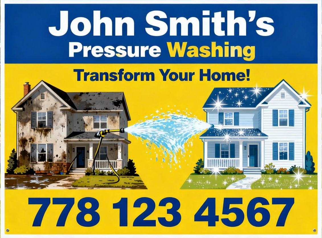
right eye-catching yard sign 24×18 size for a pressure washing business, before-and-after house cleaning concept, dirty house on the left and sparkling clean house on the right, strong water spray effect, blue and yellow color scheme, bold readable typography, simple composition suitable for lawn sign, professional advertising design, high contrast, vector styl. John Smith’s company. 778 123 4567
A cheerful birthday poster featuring a sexy girl in a bikini holding a tray with a frosted bottle of whiskey and a box of expensive cigars. The inscription, made from dollar bills, reads: Happy 55th birthday, my sweet, naughty John!

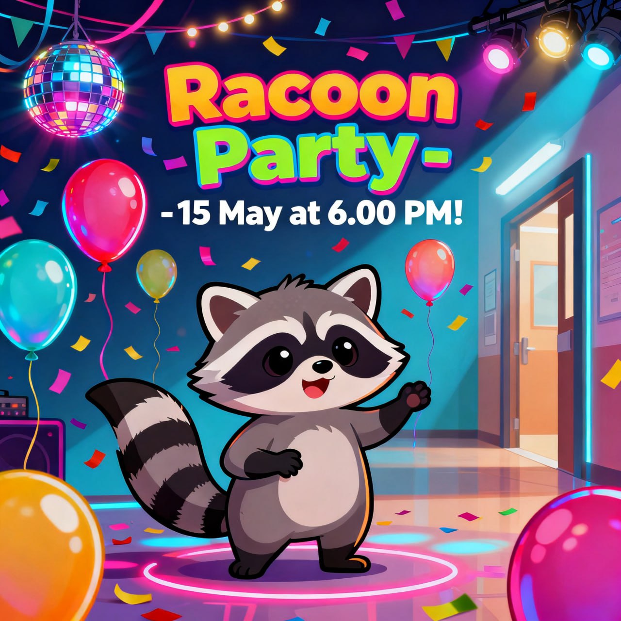
“Racoon Party – 15 May at 6.00 PM! Colorful poster for a school party event, balloons, confetti and disco lights in the background, fun ener…
Why This Method Is So Effective
Using AI together with classic poster design principles allows businesses to create professional visuals extremely fast.
Compared to traditional design workflows:
Traditional process:
- concept development
- sketching
- illustration
- layout
This can take hours or even days.
AI-assisted design can produce strong concepts in 5–15 minutes.
Best Use Cases
AI-generated poster designs work especially well for:
A-Frame Signs
Drivers must understand the message in 1–2 seconds.
Car Magnets
Design must be simple and bold.
Storefront Posters
They must attract attention from across the street.
Banners
Strong contrast and clear typography are essential.
Common AI Design Mistakes (and How to Avoid Them)
Artificial intelligence is an extremely powerful tool for generating advertising visuals. However, AI is not perfect. Without experience, it can easily produce designs that look interesting but are not suitable for real advertising or printing.
Below are some of the most common mistakes people make when generating AI designs.
1. Too Many Colors
One of the most common problems in AI-generated images is overly complex color palettes.
AI often creates images with:
- 10–20 colors
- gradients everywhere
- unnecessary visual complexity
This causes several problems:
- poor readability
- higher printing cost
- weak visual impact
Professional posters usually use 3–5 colors only.
A limited color palette creates stronger and clearer advertising.
2. Poor Readability
AI sometimes generates beautiful images that are not readable from a distance.
For example:
- text that is too small
- text placed on a busy background
- low contrast between text and background
In advertising design, readability is critical.
For outdoor signs and A-frame boards, people often have only 1–2 seconds to understand the message.
3. Overly Complex Composition
AI often tries to add too many elements to a design.
Typical issues include:
- too many objects
- cluttered layouts
- unnecessary background details
Good advertising posters are usually very simple.
The viewer should understand the message immediately.
4. Incorrect Text Generation
AI image generators are still not very reliable when generating text inside images.
Typical problems include:
- misspelled words
- distorted letters
- random symbols
- incorrect spacing
Because of this, the best workflow is:
- generate the image without important text
- add the final typography later during layout preparation.
5. Designs That Ignore Printing Constraints
AI does not understand printing limitations.
For example:
- very thin lines that cannot be printed properly
- colors that do not reproduce well on vinyl
- textures that disappear when printed large
Professional preparation ensures the design works correctly for:
- vinyl printing
- banners
- car magnets
- outdoor signs.
6. Designs That Are Too Detailed
AI sometimes generates extremely detailed images.
This may look impressive on a computer screen but becomes problematic when used for signage.
For example:
- excessive texture
- overly complex illustrations
- visual noise
For outdoor advertising, simpler designs are almost always more effective.
Why Professional Preparation Still Matters
AI is a powerful tool, but it is only one step in the design process.
At Quarter Cheaper Signs, we use AI to quickly generate visual concepts. Then we refine the design to ensure it works properly for real-world printing and advertising.
This includes:
- improving readability
- simplifying composition
- correcting typography
- preparing files for large-format printing.
The Result
By combining:
- AI image generation
- classic poster design principles
- professional print preparation
we can create strong advertising visuals quickly and efficiently.
If you need help creating designs for:
- A-frame signs
- car magnets
- banners
- storefront graphics
- posters
we can create a strong design very quickly.
- Artwork Requirements
- Design Time Vs Production Time Policy
- Free Design Policy
- How to Create Sign Designs Using AI
- Creating Sign Designs with Freelancers
- Why Not Use Canva for Sign Design
- Creating Advertising Designs with AI: Using the “In the Style Of” Method
- 2 ways to make complex AI-generated designs “print-ready”